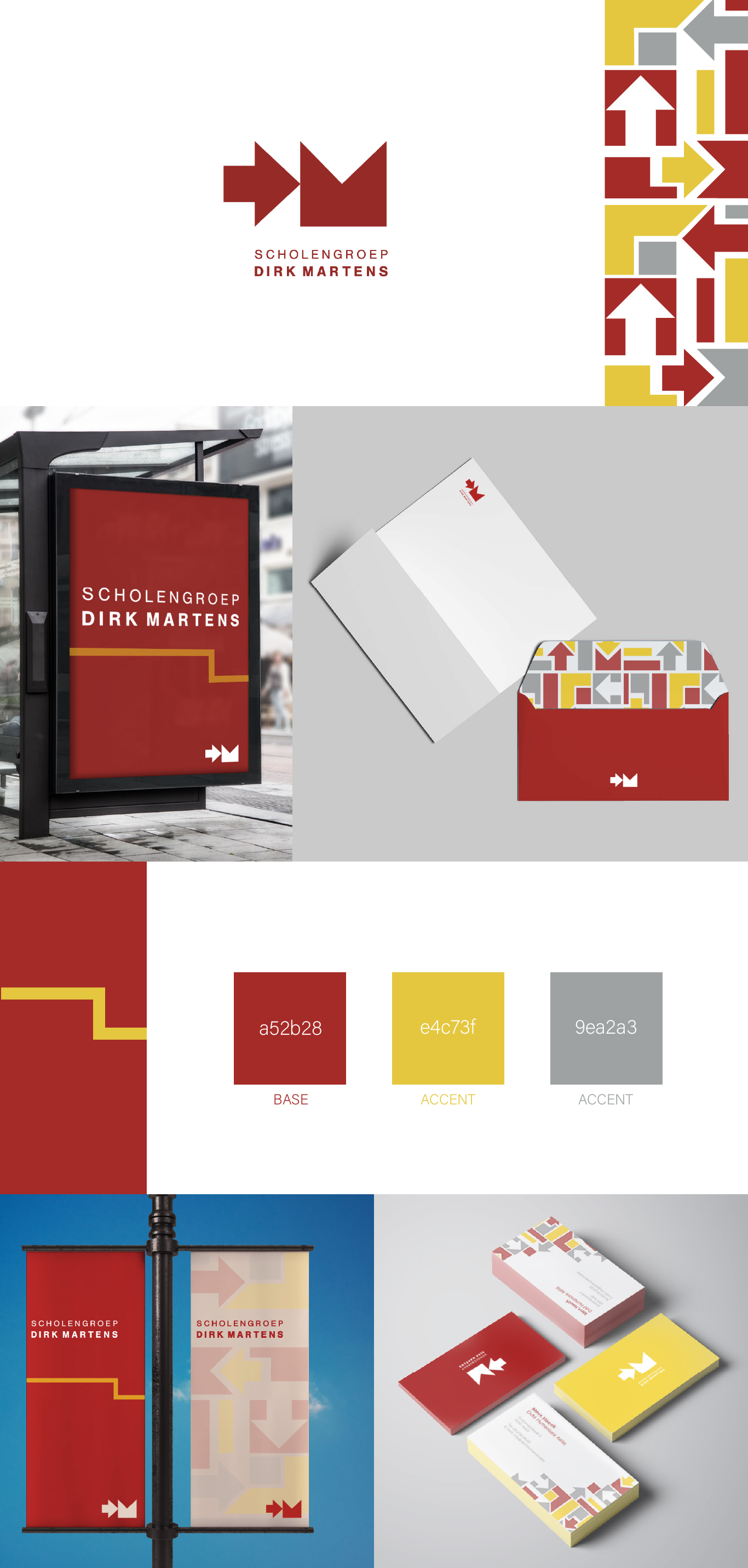
DIRK MARTENS GROEP
Branding
I designed a bold, flexible identity for Scholengroep Dirk Martens, a network of schools united under one organization. The visual system is built from modular arrow shapes that represent guidance, movement, and the many paths students can take. The logo is a geometric derivative of the initials DM, abstracted into a forward-pointing symbol that ties directly into the wider graphic language. A deep red base conveys strength and warmth, complemented by an energetic yellow and balanced with soft grey. Applied across stationery, signage, and environmental graphics, the identity creates a strong, cohesive presence while remaining adaptable for the different schools within the group.